Creating a cohesive look using a limited color palette is an art form that can dramatically enhance the aesthetics of any environment, from fashion choices to interior designs. The three-color rule is especially effective, allowing for a harmonious balance that can elevate your style without overwhelming your audience. This article delves into the principles of color theory, practical applications in various domains, and tips for achieving a cohesive look with just three main colors.
Understanding Color Theory
Color theory is the foundation for creating a cohesive look. It encompasses the principles that govern the visual arrangement of colors, their relationships, and how they affect one another. Three essential components of color theory include:
-
Color Wheel: This circular diagram organizes colors into primary, secondary, and tertiary hues. The primary colors (red, blue, and yellow) combine to form secondary colors (green, orange, and purple).
-
Color Harmony: This refers to aesthetically pleasing color combinations. Different schemes such as complementary, analogous, or triadic colors can be employed to create visual appeal.
-
Color Context: How colors interact within a composition can change their appearance and meaning. Context helps convey emotions, brand identity, or thematic content.
The Power of the Three-Color Palette
Using three main colors is a powerful design strategy. It allows you to express creativity and maintain order without excessive complexity. Here’s how to effectively utilize a three-color scheme:
-
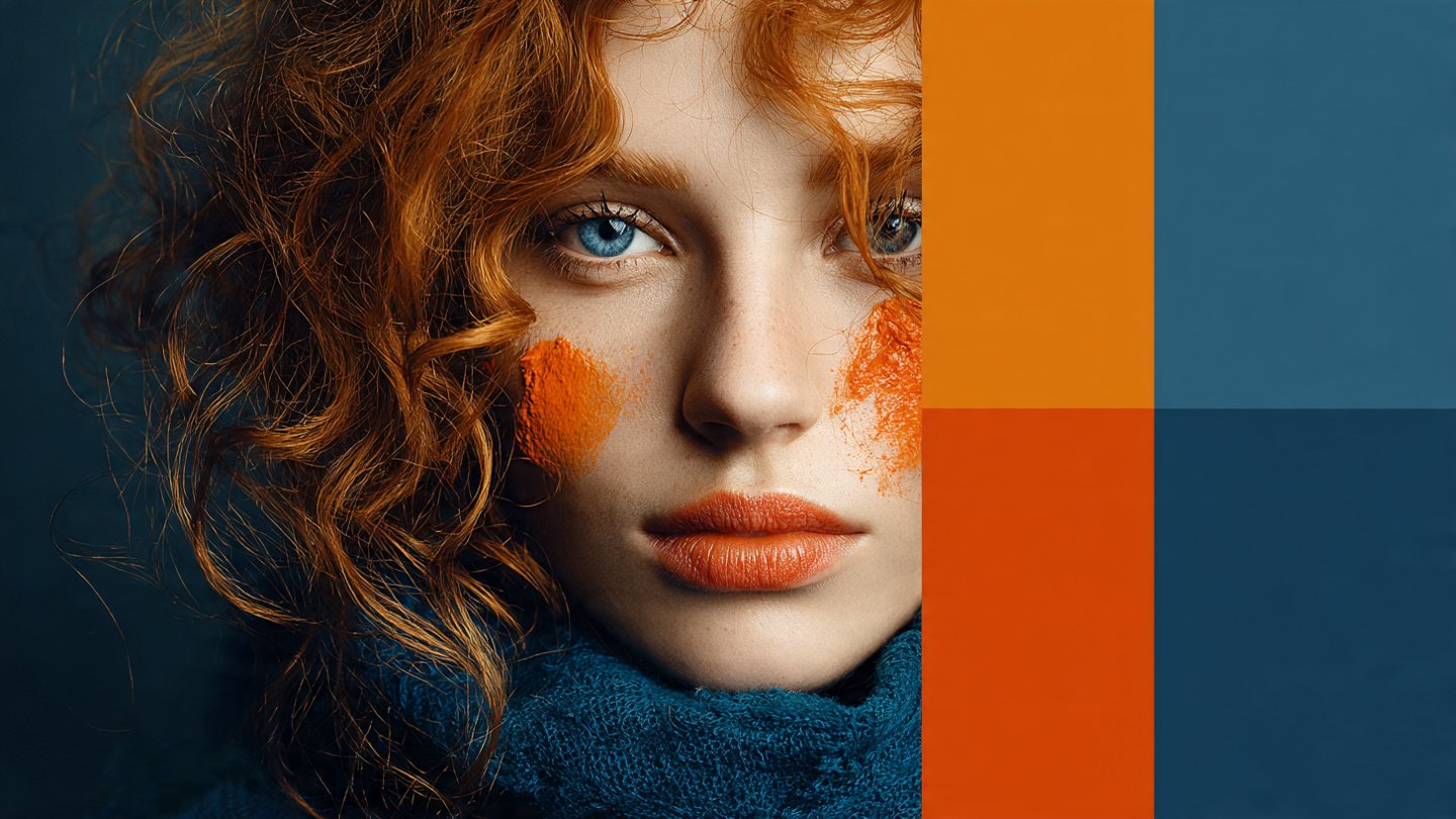
Choosing Your Palette: Selecting your three colors is the first step. Choose one dominant color, one secondary color, and an accent color. A popular choice is to select colors that are either complementary or analogous. For example:
- Complementary: Blue (dominant) – Orange (secondary) – White (accent)
- Analogous: Green (dominant) – Blue (secondary) – Yellow (accent)
-
Balance and Proportion: When applying your colors, consider their proportions. The dominant color should comprise 60% of your design, the secondary color 30%, and the accent color 10%. This balance will create visual hierarchy and focus.
-
Incorporating Neutrals: To provide breathing space and sophistication, consider adding neutral tones like white, gray, or beige. Neutrals can serve as a canvas, allowing your three main colors to shine while maintaining cohesiveness.
Applying the Three-Color Rule
Let’s examine how to effectively apply the three-color rule in various settings, including fashion, interior design, and branding.
Fashion
Wardrobe Coordination
Fashion is an excellent arena to illustrate the efficacy of a three-color scheme. Here are some practical tips for coordinating an outfit:
-
Start with a Statement Piece: Identify a primary item in your wardrobe that features your dominant color, such as a dress, suit, or coat.
- Example: A navy dress can serve as a versatile foundation.
-
Layering with Secondary Color: Introduce the secondary color through accessories, such as shoes, bags, or scarves.
- Example: Pair the navy dress with rust-colored ankle boots for a striking visual appeal.
-
Accent Touches: Use the accent color sparingly to avoid overwhelming your ensemble. A bright handbag or bold jewelry can serve as effective accent pieces.
- Example: A mustard yellow clutch can add a pop of color without overdoing it.
Seasonal Trends
Awareness of seasonal color trends can also aid in creating a cohesive look. For example, earthy tones may dominate fall collections, while pastels are often seen in spring. Adapting your three colors to seasonally relevant shades can keep your wardrobe fresh and inspiring.
Interior Design
Creating a cohesive look in interior design necessitates careful consideration of color psychology and harmony. Here are steps to achieve a stylish space:
Room Preparation
-
Choose a Focal Point: Identify a primary color for your walls, which will dominate the room.
- Example: Opt for a soft gray for a calming effect.
-
Secondary Color for Furnishings: This color should complement the walls and appear in upholstery, rugs, or curtains.
- Example: Use mustard yellow for a vibrant sofa or curtains that add warmth.
-
Accent Color for Small Details: Introducing the accent color through artwork, cushions, or decor items can provide interest without overwhelming the senses.
- Example: Use deep teal throw pillows for a pop against your yellow sofa.
Textures and Materials
Use varying textures to enhance the visual richness of your chosen colors. Different materials like wood, metals, and fabrics can add dimension and interest. For example, a matte gray wall paired with a glossy mustard yellow sofa and textured teal pillows creates a visually stimulating design.
Branding
Branding is another area where the three-color rule can have a significant impact. A well-designed brand identity relies on color psychology and brand recognition.
Choosing Your Brand Colors
-
Identify Values: Determine the core values of your brand and choose colors that convey these effectively. For instance:
- Blue suggests trust and professionalism.
- Orange conveys enthusiasm and creativity.
-
Create a Color Hierarchy: Just as in fashion and interior design, use a dominant color for your logo, a secondary color for supporting materials, and an accent for promotional content.
- Example: A tech company might use dark blue (dominant), bright green (secondary), and light gray (accent).
Consistent Application
Ensure that your chosen color palette is consistently applied across all branding materials, including websites, business cards, packaging, and social media. Consistency strengthens brand recognition and builds trust with your audience.
Additional Tips for Cohesion
-
Test Your Palette: Use color swatches or digital design tools to visualize how your colors will work together. This can save you from costly mistakes later on.
-
Consider Lighting: The lighting in a space can drastically alter the perception of colors. Always observe your chosen colors in various lighting situations to ensure they maintain their intended effect.
-
Seasonal Adjustments: Just as nature changes, consider refreshing your three-color scheme seasonally. Swap out accent colors or rotate decorative items to keep your look vibrant and current.
-
Seek Inspiration: Platforms like Pinterest, Instagram, or interior design magazines can serve as excellent sources of inspiration. Learn from others who effectively employ a three-color palette in their work.
-
Feedback Loop: Consult friends, family, or colleagues for their perspectives on your color choices. Fresh eyes can offer valuable insights and help refine your vision.
Conclusion
Achieving a cohesive look with just three main colors is entirely possible and can be achieved through a deliberate understanding of color theory, careful selection, and proportionate applications. Whether you’re coordinating an outfit, designing an interior, or developing a brand identity, this approach will aid in creating harmony and visual appeal without the chaos of overly complex palettes.
As you practice, remember that confidence in your choices is key. Feel free to experiment and adjust your selections until you find a trio that resonates with your personal style or brand identity. With patience and creativity, you can craft a cohesive look that stands out, leaving a lasting impression on all who experience it.